DAY1
前言:
在开始熟悉微信小程序的搭建以及相关逐渐的学习之前,首先我们要先明白微信小程序的一个页面包含哪些文件,分别起到什么作用?
.js:页面脚本文件,存放页面数据以及事件处理函数
.json:页面配置文件,配置页面窗口外观
.wxml:页面的模板结构文件
.wxss:当前页面的样式表文件
1.view和scroll-view组件的学习
1.view组件
该组件在.wxml文件下使用,例如:
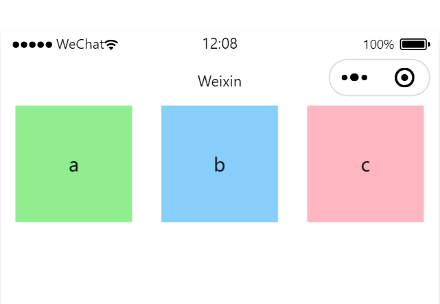
<view class="container1">
<view>a</view>
<view>b</view>
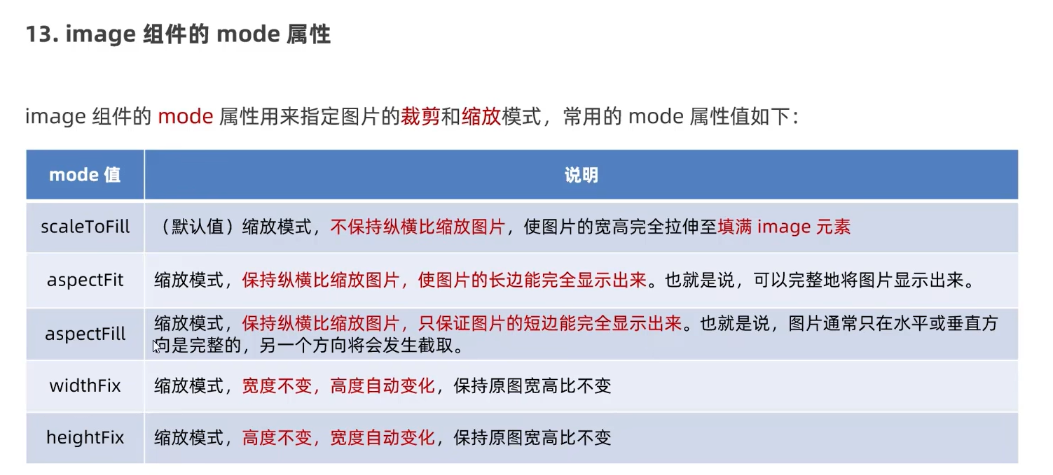
<view>c</view>
</view>以上代码定义了以container1作为模板容器的view对象。
结合.wxss文件对container的完整定义可知:
.container1 view {
  width: 100px;
  height: 100px;
  text-align: center;
  line-height: 100px;
}
.container1 view:nth-child(1){
  background: lightgreen;
}
.container1 view:nth-child(2){
  background-color: lightskyblue;
}
.container1 view:nth-child(3){
  background-color: lightpink;
}

.container1 {
  display: flex;
  justify-content: space-around;
}
以上css文件定义了一个长宽均为100px,且文本居中,行高100px的container1的view组件对象模板,同时定义了三个子对象,背景颜色不同,同时对应container1容器整体而言,定义了水平摆放,同时每个容器之间以空格隔开。
效果图:
2.scroll-view组件
在.wxml文件中写下:
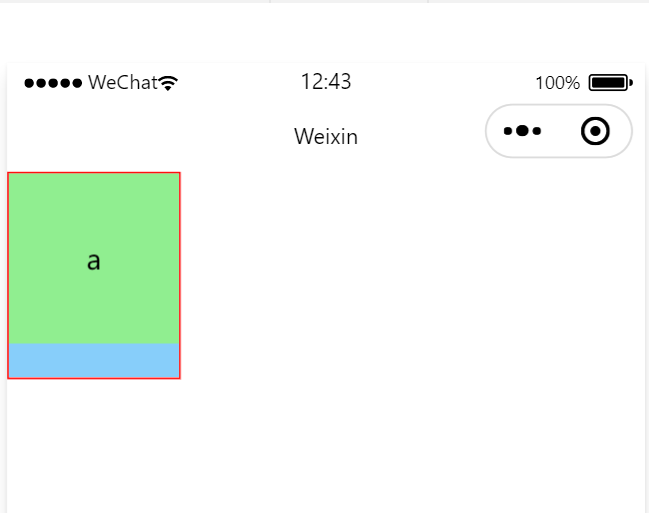
<scroll-view class="container1" scroll-y>
  <view>a</view>
  <view>b</view>
  <view>c</view>
</scroll-view>
让这容器成为一个y轴方向滑动。
同时修改.wcss文件下的container1容器中的定义:
.container1 {
  border: 1px solid red;
  width: 100px;
  height: 120px;
}
给这个垂直方向的下拉框定义1px的红实线,同时定义宽100px,高120px,效果图:
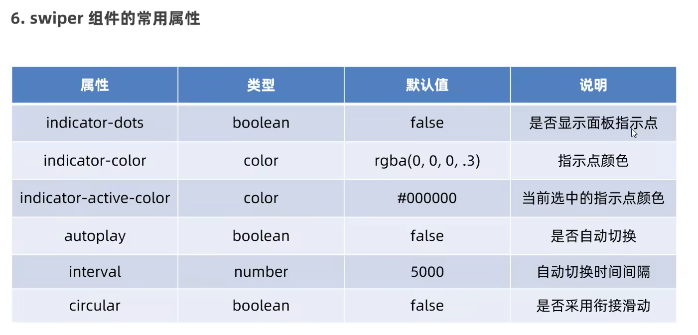
2.swiper和swiper-item组件
轮播组件效果.wxml文件代码:
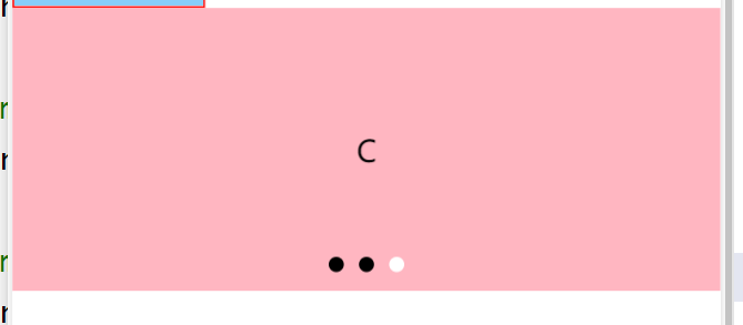
<swiper class="swiper-container" indicator-dots indicator-color="black" indicator-active-color="white" autoplay interval="3000" circular>
  <swiper-item>
    <view class="item">A</view>
  </swiper-item>
  <swiper-item>
    <view class="item">B</view>
  </swiper-item>
  <swiper-item>
    <view class="item">C</view>
  </swiper-item>
</swiper>
.wcss文件代码:
.swiper-container{
  height: 150px;
}
.item{
  height: 100%;
  line-height: 150px;
  text-align: center;
}
swiper-item:nth-child(1) .item{
  background-color: lightgreen;
}
swiper-item:nth-child(2) .item{
  background-color: lightskyblue;
}
swiper-item:nth-child(3) .item{
  background-color: lightpink;
}
效果图:
3.text和rich-text组件
text:文本组件,类似于HTML中的span标签,是一个行内元素。
rich-text:富文本组件,支持把HTML字符串渲染为WXML结构。
1.text组件
直接写在.wxml文件内:
<view>
    <text selectable>长按选中功能测试</text>
</view>
2.rich-text组件
同样写在.wxml文件内:
例子:
<rich-text nodes="<h1 style='color: red;'>标题</h1>"></rich-text>功能为将HTML字符串渲染为对应的ui结构,上例子为展现一个红色的’标题‘字体。
4.button和image组件
button:按钮组件,可以通过open-type属性可以调用微信提供各种功能(客服、转发、获取用户授权、获取用户信息等)
image:图片组件,image组件默认宽度为300px、高度约为240px。
navigator:页面导航组件,类似于HTML中的a链接。
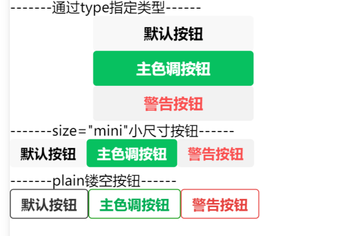
1.button组件
<view>-------通过type指定类型------</view>
<button>默认按钮</button>
<button type="primary">主色调按钮</button>
<button type="warn">警告按钮</button>
<view>-------size="mini"小尺寸按钮------</view>
<button size="mini">默认按钮</button>
<button type="primary" size="mini">主色调按钮</button>
<button type="warn" size="mini">警告按钮</button>
<view>-------plain镂空按钮------</view>
<button size="mini" plain>默认按钮</button>
<button type="primary" size="mini" plain>主色调按钮</button>
<button type="warn" size="mini" plain>警告按钮</button>
效果:
2.image组件
在.wxml中:
<image></image>
<image src="/images/1.png" mode="aspectFit"></image>
在.wcss中:
image{
    border: 1px solid red;
}